
Charm Coffee Co.
Branding, Socials, Merchandise

Charm Coffee is a fictional cafe that provides a community space for people wanting to get their work done or grab some quality coffee with a friend. The cafe prides itself on always providing the highest quality food/drink and creating a positive environment where people can feel inspired to work on their projects.
Timeline: 5 weeks Tools: Figma
Challenge
Charm Coffee will be launching their location May of 2025. In order to drive foot traffic and have people want to try our location an identifiable brand look is essential. There is an abundance of cute cafes in the area so Charm will have to stand out through a recognizable logo and visual identity, eye-catching cup packaging, and a website for people to get to know their MVV. In order to spread brand awareness and word of mouth, strong merchandise is also beneficial. Given that the market is so competitive, Charm must be able to carve out their niche and have the target demographic be able to find them.
Research/Inspiration
In this project much of my research persisted on how to best position the brand to not only be successful but stand out from an oversaturated/competitive crowd. To best accomplish this, research on local competitors was conducted. Everything from their location, industry trends, and branding was analyzed. A SWOT analysis was also conducted to best understand the brand’s position. This research is most explored in the design exploration of the project.
Personas


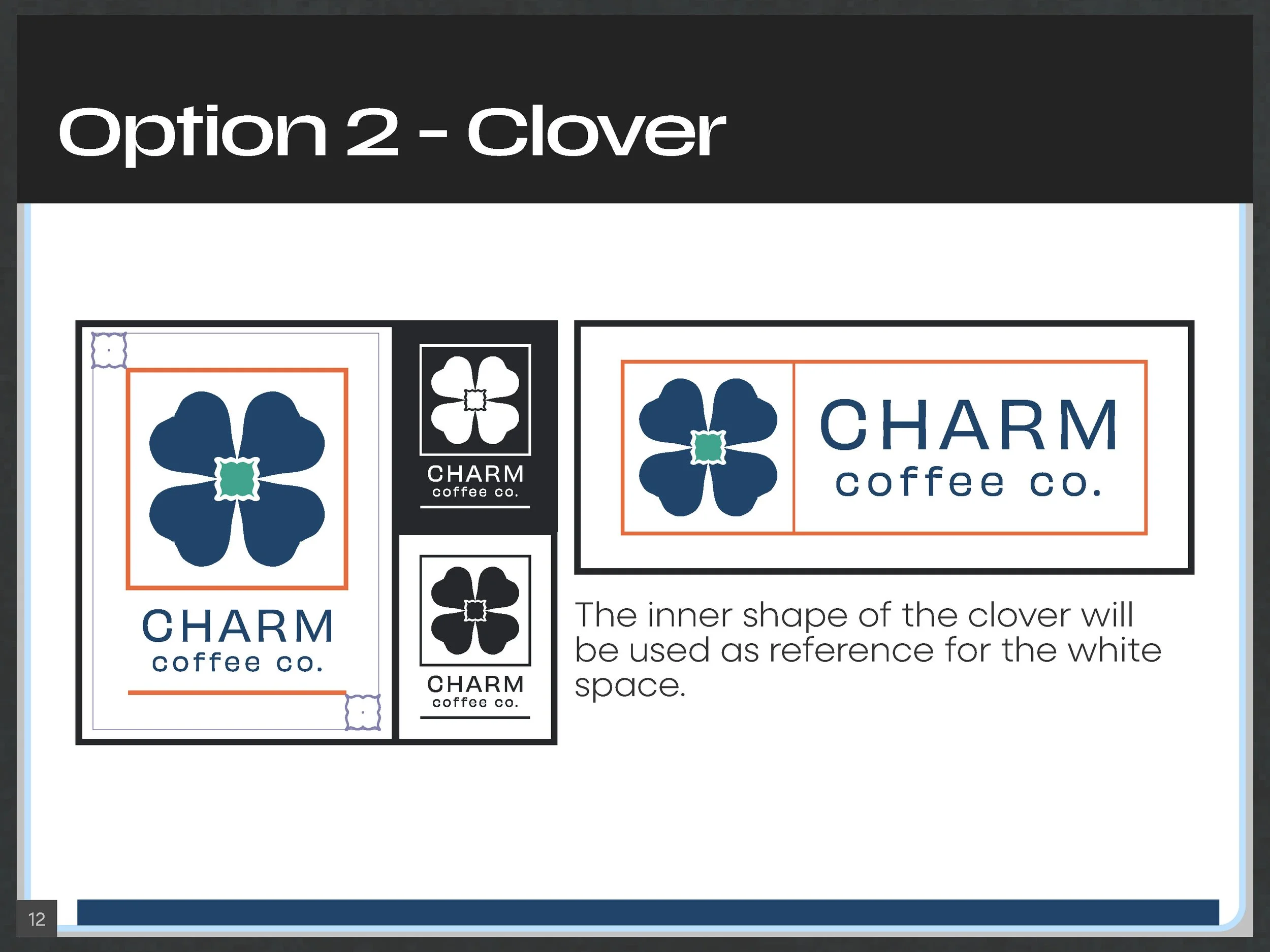
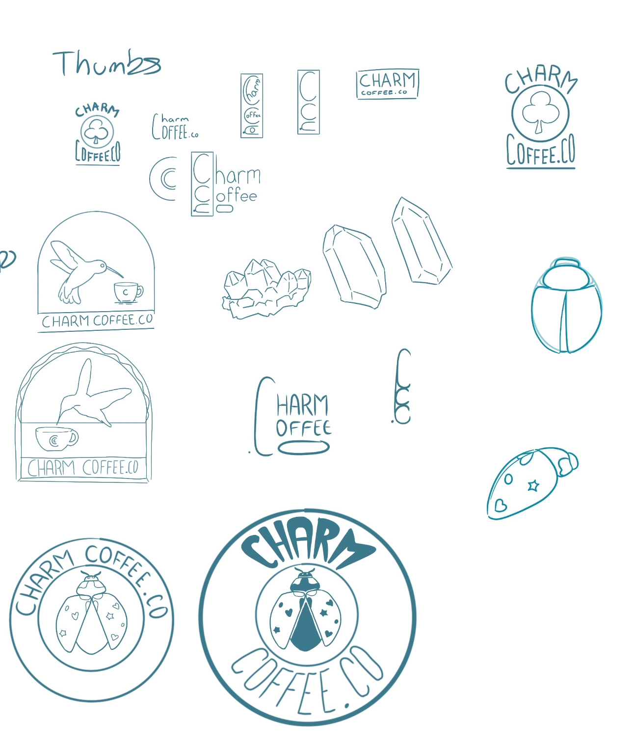
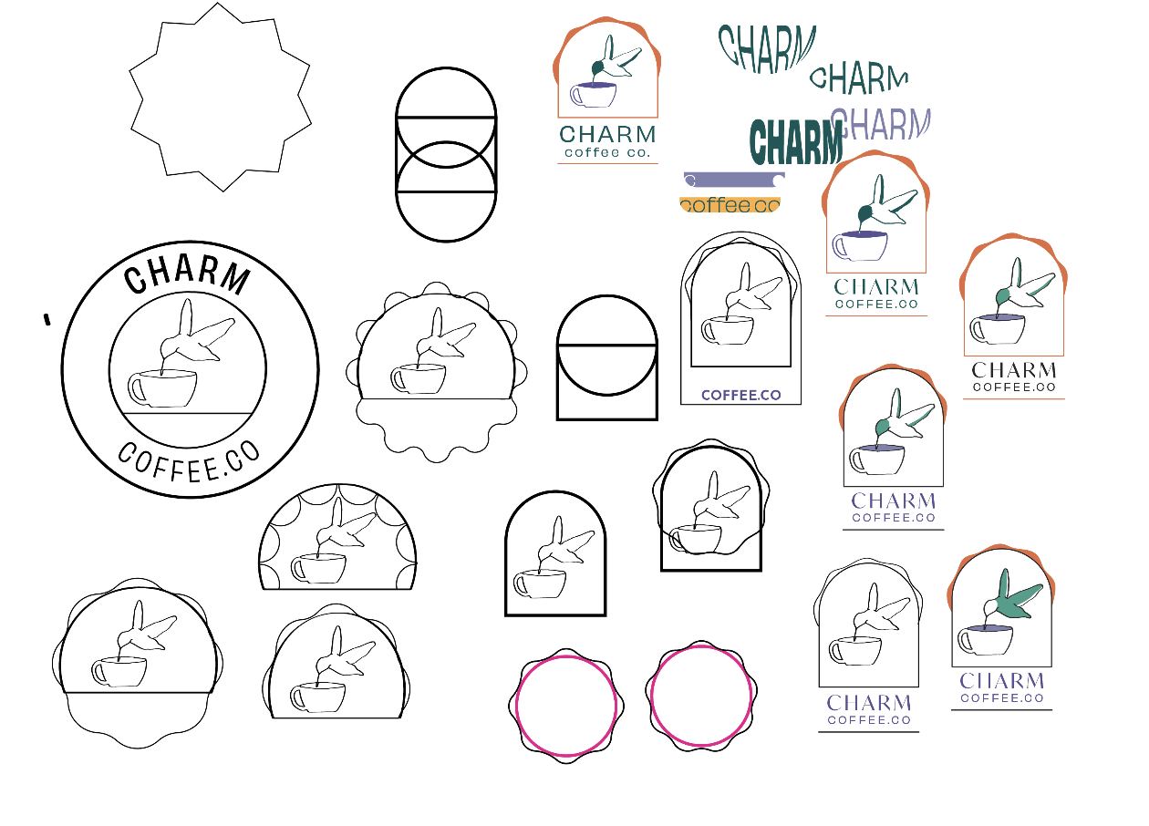
Logo Options


Process
Design Solution
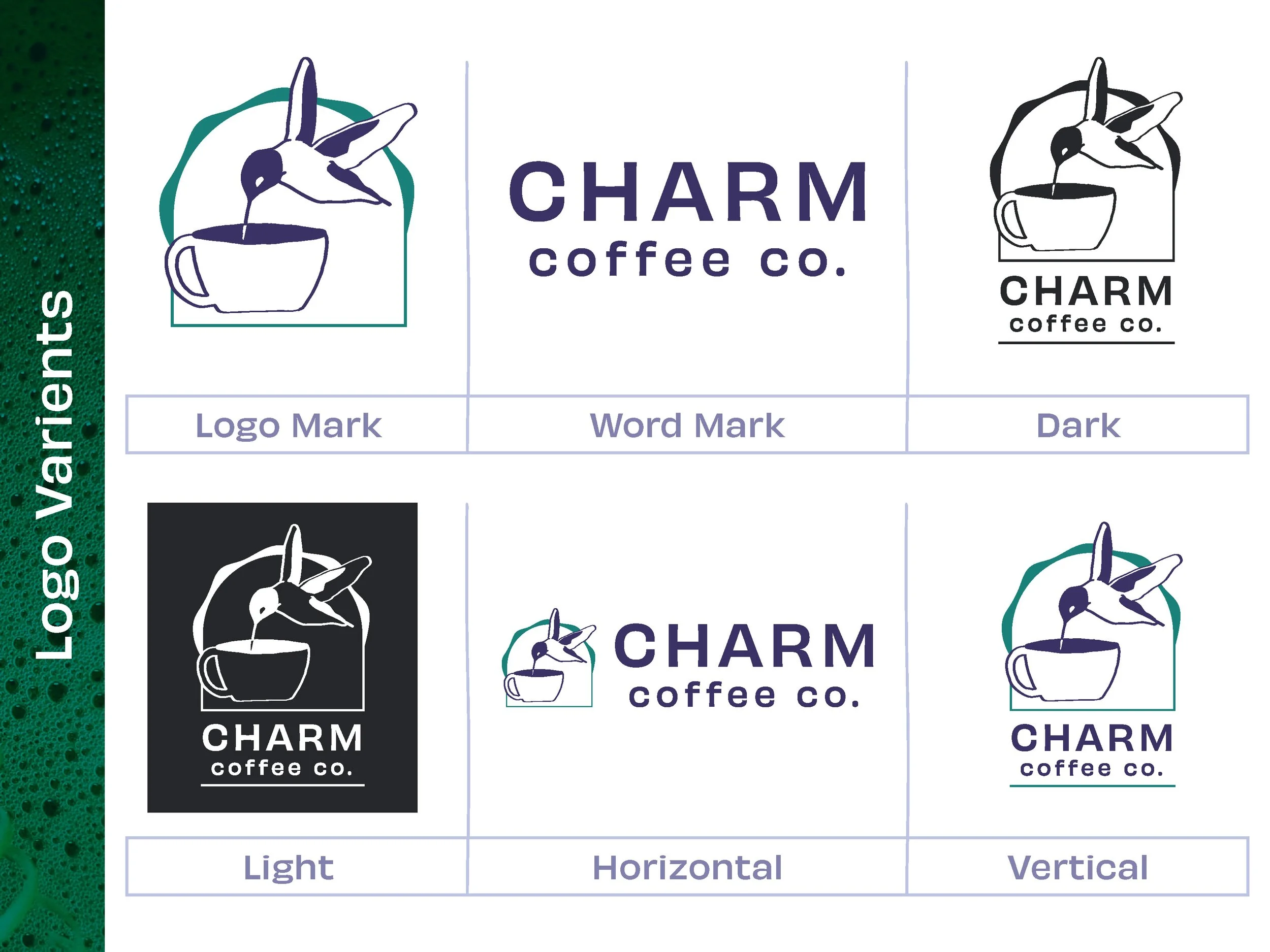
The logo is simple but carries a lot of character. It is common knowledge that the humming bird will feed from a variety of tropical flowers. In the logo the humming bird is feeding from a cup of coffee. As students are the main demographic, the humming bird can also represent the customers receiving enough energy from their drinks to finish whatever they need to do.
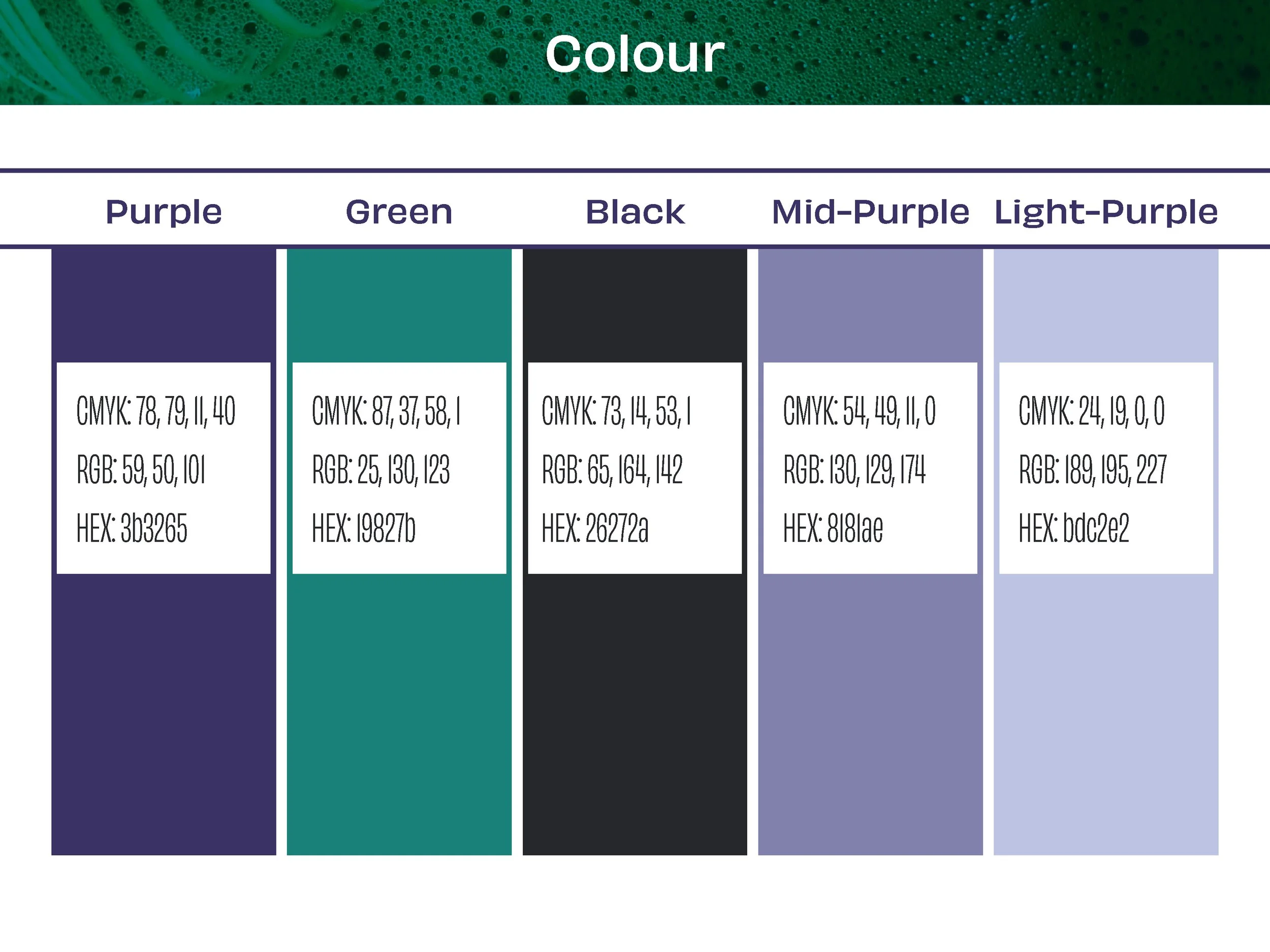
In my research I found that more than a few of my competitors such as Coffee Culture, Starbucks and Williams Cafe utilize an over saturated design style. Incorporating woods and earth tones, a clear type of cafe emerged and so in the design solution it was essential that I take a different approach. How I chose to differentiate myself is best exemplified through the colours I chose. They are well saturated and have cooler tones. Charm is a space for relaxing and being productive. The colours are inviting and calming. The use of purple specifically is also significant, as it is not a conventional colour for cafes, making the brand stand out among the rest.
Click the link and find the full brand book of this project.
https://drive.google.com/file/d/1CgyTxKFSpknDd6-aEcK894d_5_tZE4X2/view?usp=sharing
Graphic Elements
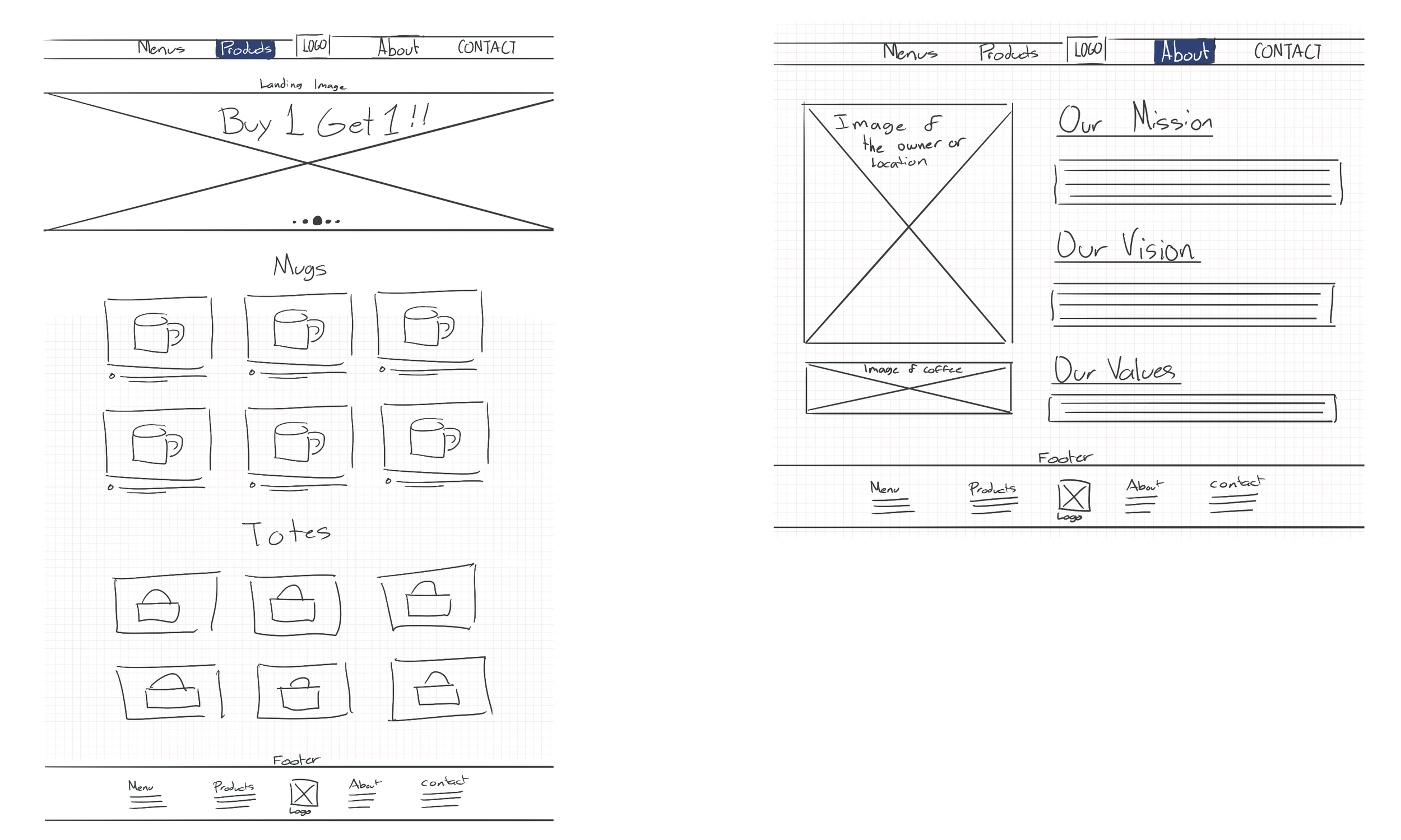
Web Design
Social Media


Merchandise


Reflection
Personally this was one of my favourite projects to work on. I essentially based the target audience after myself, as I find it easier to be productive when not at home and often visit local cafes. I believe this project goes to show that cliche interior design and branding is boring and just because it is a coffee brand, does not mean there shouldn't be experimentation.